Public voting is currently closed.
Overview
Project Details
Category
Customer
Submitted by
Timeframe
Tech Stack
Services
Demo Link
Team
Link to case study
Description
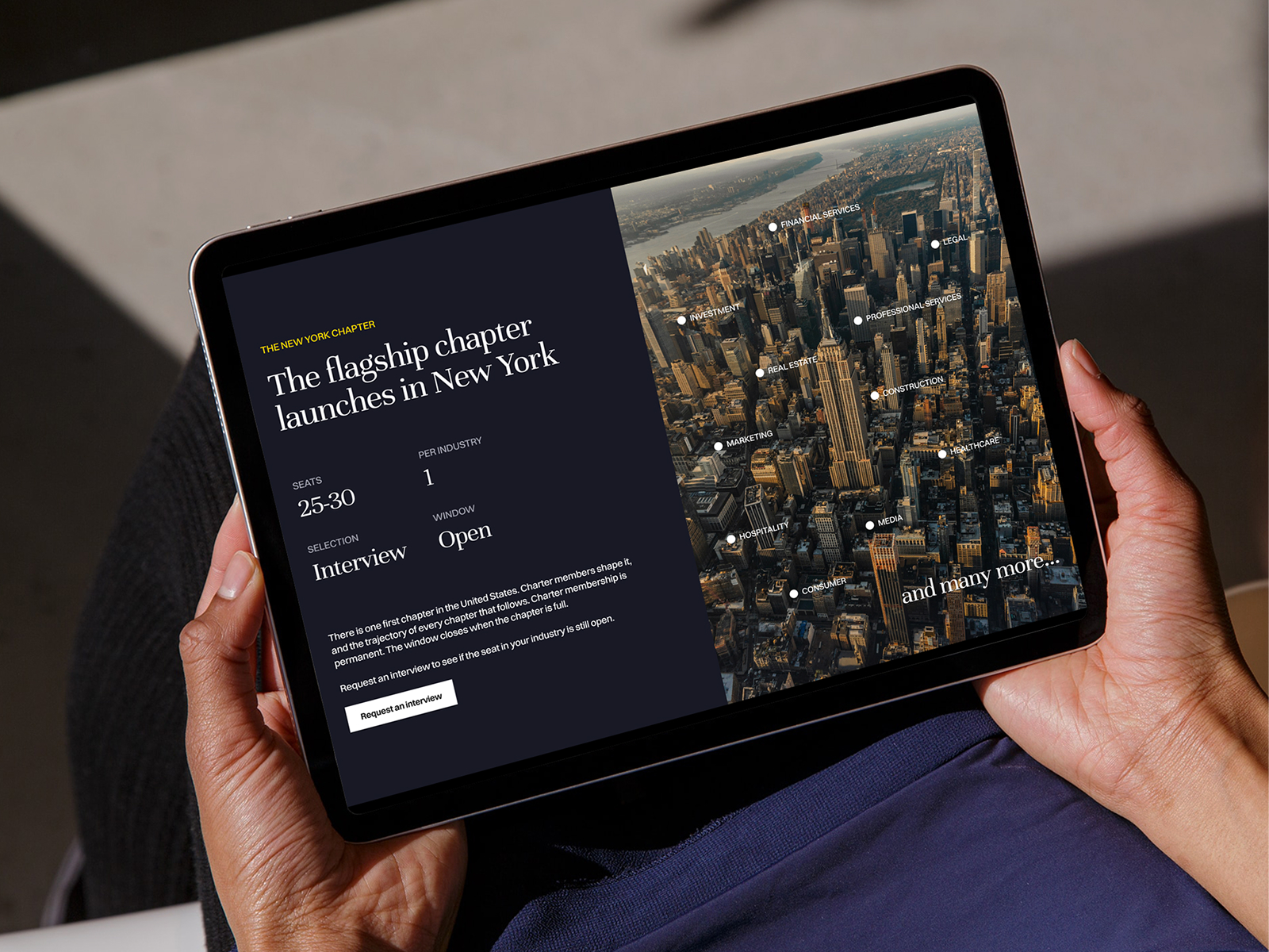
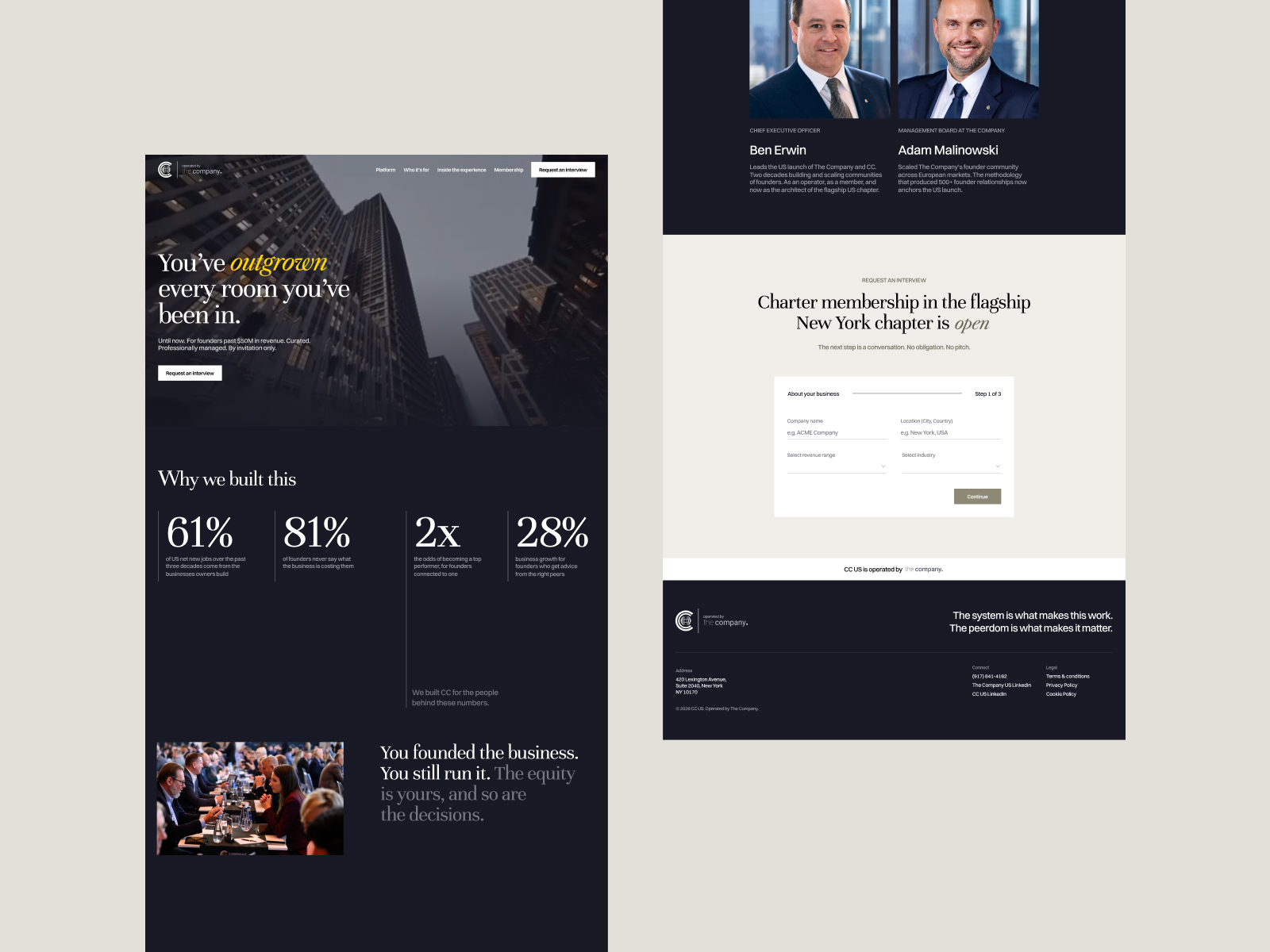
CC USA is an invitation-only community of entrepreneurs and business leaders, part of the wider Corporate Connections network. They came to us ahead of their New York launch. The organization had over a decade of experience running chapters in other markets, but the existing digital presence wasn't going to work in NYC. It didn't look like the rooms they were inviting people into.
That was the real brief. The audience is founders and executives who see a hundred pitches a week and give a website about eight seconds. The site had to signal curation and seriousness immediately, before anyone read a word. It also had to earn trust, because "exclusive network" is a phrase that makes this audience suspicious by default.
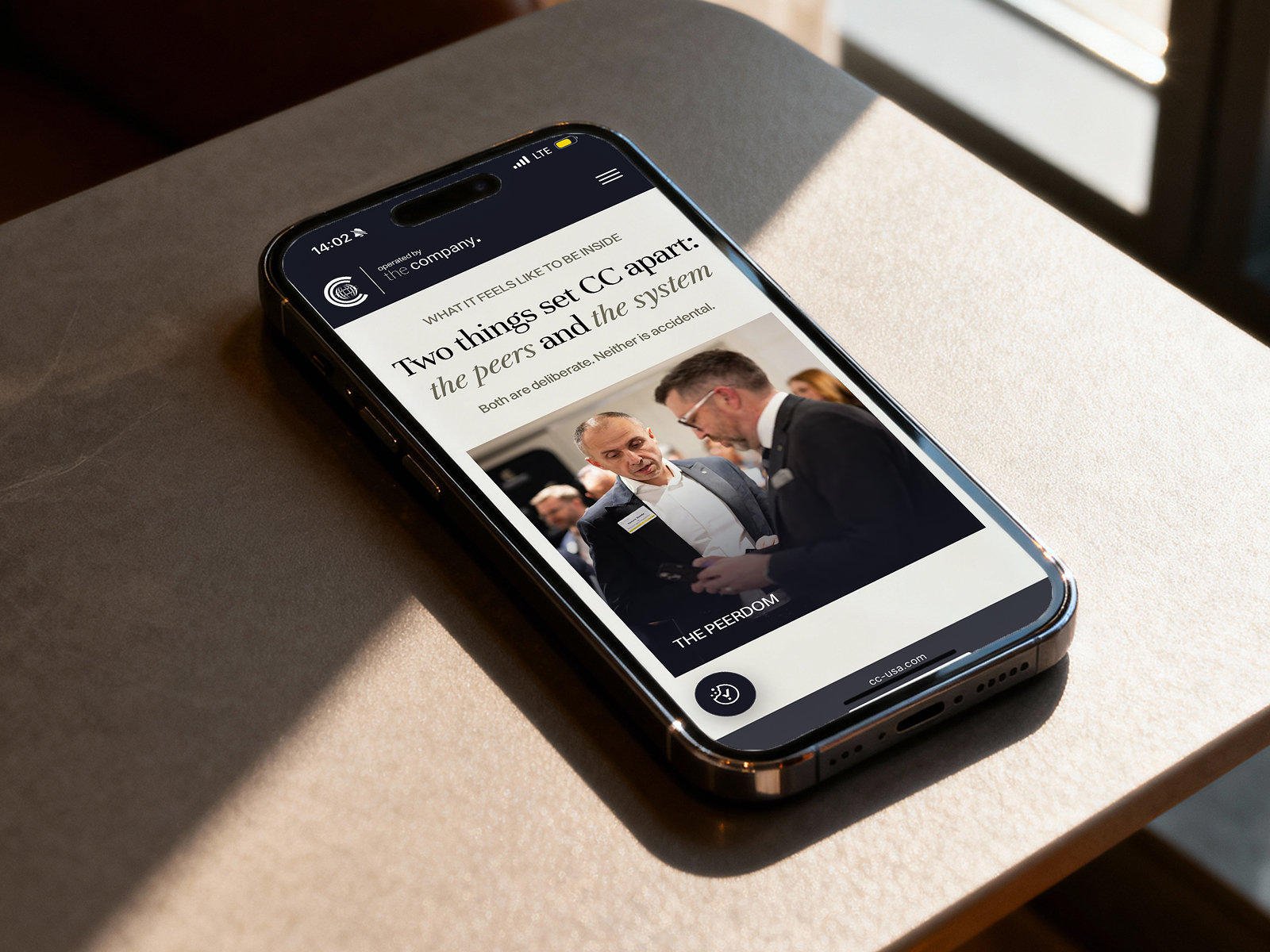
We skipped the conventional marketing site structure and built the experience around storytelling instead: smooth scrolling, a clean layout, editorial photography, and a dark visual language that feels closer to a private members' club than a landing page. The restraint is the point. Nothing shouts, because the people this site is for don't respond to shouting.
Accessibility was a requirement from day one, not a retrofit, so the interface was designed to meet modern accessibility standards throughout. The whole project ran one month, from discovery workshops through design, design system, and Webflow implementation.
The site is now how CC USA attracts, qualifies, and onboards members in New York. It's also the first dedicated website for the US chapter, which makes it the template for how the rest of the Corporate Connections network can look going forward.